The importance of using proper technique is key when trying to create "crave ability" when a dish walks the floor and is placed in front of a diner. I've posted something similar, but this one well be more in depth and serve hopefully as a how to.
Height
How and when.
 The how I see as easy myself, but with that said I still struggle with it from time to time as one my instructors once said "Just because it's easy doesn't make it simple" you can achieve height by simply stacking things on each other,
 but, when you do that you kind of end up with something like the above. it's cool... but it's missing something it's got all the elements there, height, contrast, color, and negative space so what could be missing? Personally I think it's because the height is... artificial it's not natural at all. I think it would better if it were actually just all flat. like this one here, it's missing height, but you can't tell it's complete without it.
 Contrast
Colors vs textures.

There are a two different methods in creating contrast on a plate, I think that the most common method and by far the easiest is done with color, rarely do you see it done with textures or even shapes, and if it is done it goes largely unnoticed, even I stand guilty of this charge. This plate in my opinion is nearly flawless and I think to most people it would be flawless! The ONLY thing I would change here is the sprig of rosemary sticking out, the way I was taught is "if it's not edible it shouldn't be on the plate" "If it's on a plate they will try to eat it!"The contrast here is done in two ways and the second is very subtle and that's the contrast in textures. You have chewy or maybe soft flaky texture from the fish, crunch from the green beans, and light from the mouse or mash of some kind, THEN you have the crispy, very crunchy texture from the brittle there. and of course you have all the different colors on the plate.
Color
 Natural vs artificial.
This might seem almost silly, but it's true let's say... You have a plate of eggs in front you right? you're expecting them to be yellow maybe with some white or some color from the cooking process but instead of that you get... What's your first reaction to this? Mine is: What in holy mother of god did they do this? is this safe to eat?! It looks like it's gone nuclear! Second.. A very far second is oh, maybe it's like Dr. Sues Green Eggs and Ham, that's kind of cool. *shudders* I'm going to have nightmares. That's what I mean by natural vs artificial be careful when changing the color of food from the expected to the very unexpected, it will go either of two ways: Good, or VERY bad, very quickly.
Negative space
Why?

Why... hmm, I'm having a hard time coming up with an actual reason here. The best reason I can give is... imagination. Now let's see what http://designmodo.com has to say:Too little space makes a design feel crammed, busy, cluttered and difficult to read. Even if the effect you are going for is one of chaos, space matters. Think of the space between lines of type, for example, without enough letters can touch and become unreadable.

That's perfect! There's just to much going on, you're so distracted by everything it's hard to concentrate on just one element of the plate, you lose interest, nothing is distinguishable from anything else. with that said, "flooding" the plate is a perfectly okay thing to do when plating, just use the sauce or what stock what have you as your negative space, negative space is just unoccupied space.
Flow
Right, right, right, left?!
what does this even mean? I mean; lines, line should flow in the same direction. If you have have four pieces of Asparagus three of which are going root to head THAN you have one going the opposite way messing up everything, it doesn't flow anymore, it's broken, you broke it. but! It is easy to fix, just turn the one little rebel the same way as it's friends and everything is okay.
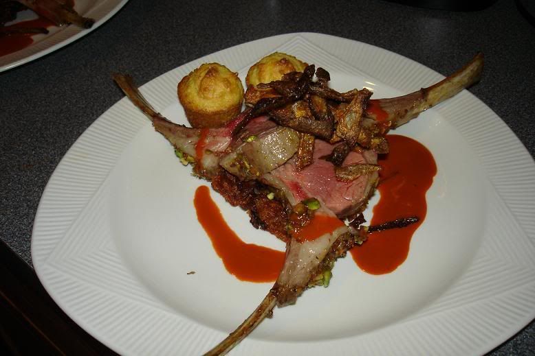
Notice, your eyes seem to stop when it get's to the
bone that is not following the same direction as
the other two.
Position
How to avoid... Stuff.
 By stuff I mean, symbols and faces. Let's take a look at the placement of the carrots and nuts, what does it remind you of? Right? now weather this was intentional or unintentional I couldn't say, but, you have to keep these things in mind, just stand back look it, look for something that shouldn't be there, and keep it in mind when put long slender objects on a plate next too round objects, or round objects on smaller or bigger rounder shapes...
No comments:
Post a Comment